In the Analysis tab, you can evaluate the results of your LCA report. The analysis shows the results either as a chart by life cycle stages or as a balance table.
The analysis always refers to the selected structural element and the functional unit from the base data.
How it works
- Open the Analysis tab.
- Select the relevant Structural element.
The selection is kept for both subtabs. - Switch between the subtabs:
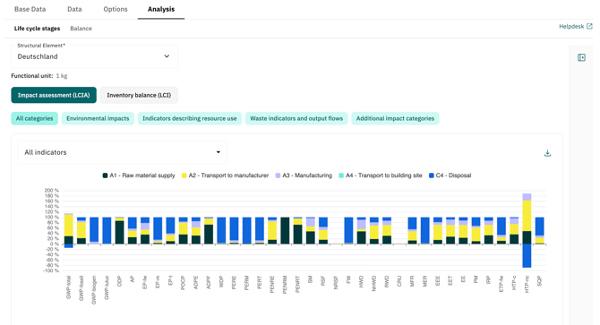
- Life cycle stages: shows the results as a stacked bar chart.
- Balance: shows the results as a table.
- Select the display mode:
- Impact assessment (LCIA)
- Inventory balance (LCI)
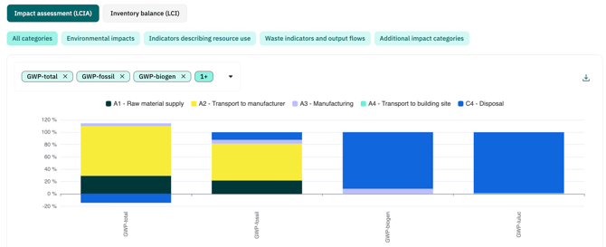
- Filter the displayed indicators using the category chips.
In LCIA mode, several categories are available, for example Environmental impacts or Waste indicators and output flows.
In LCI mode, the biogenic carbon content is displayed. - Use the indicator dropdown to display all indicators or selected indicators only.
Life cycle stages
In the Life cycle stages subtab, the results are displayed as a stacked bar chart. The x-axis shows the indicators. The colors show the life cycle stages from the report configuration.
Positive contributions are displayed above the zero line. Negative contributions are displayed below the zero line.
The chart shows percentages. The shares are calculated per indicator across all displayed life cycle stages.
Use the download icon in the top right corner of the chart area to download the chart as an image file.
Balance
In the Balance subtab, the results are displayed as a table. The table shows the absolute value for each indicator and life cycle stage.
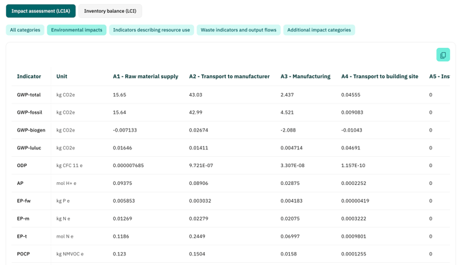
The table contains:
-
the indicator
-
the unit
-
the life cycle stages from the report configuration
The first column remains fixed. Additional stages can be scrolled horizontally if not all columns are visible.
Copy dataUse the copy icon in the top right corner of the table to copy the currently displayed data. You can then paste the data directly into Excel and continue working with it.
The copied data reflects the current view. The active mode and active filters are taken into account.
Note
The analysis only shows life cycle stages. Sub-stages are not displayed.
If no activities have been added for the selected structural element, a message is displayed. Add activities in the Data tab to see results.
Negative values are included with their sign and displayed accordingly.
Why can bars exceed 100% or fall below 0%?The chart calculates the shares for each indicator based on the actual values. Negative values are included with their sign.
This means that the total value of an indicator is the sum of all positive and negative contributions. If one life cycle stages has a negative contribution, the positive stages can add up to more than 100%. The negative contribution is shown below the zero line and brings the total back to 100%.
Example:
-
Positive stages: 106.25%
-
Negative stage: −6.25%
-
Result: 100%
This display is correct. It shows how strongly each life cycle stage contributes to the actual net result of the indicator.
Negative contributions can occur, for example, when a negative emission factor is used for an activity.
Glossary
A glossary is available on the right side of the analysis area. It contains the indicators with a short description. The glossary can be expanded and collapsed. You can use the search to search for indicator names.
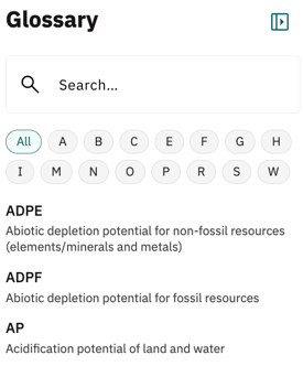
Good to know:
The glossary shows all indicators, regardless of the filters currently applied in the chart or table.